Creating a GenAI-Powered Excel Add-In - Part 02 - Generating Graphs
This is Part 2 in the tutorial series on creating a GenAI-powered Excel Add-In to automatically create plots for your data. Make sure to check out the previous entry to be able to seamlessly continue on.
In this part, we're upgrading our Add-In by swapping out the color-cells feature for a new function that generates a graph from the data selected by the user in their worksheet. Additionally, we're setting the stage for Part 03, where we will dive into coding the Backend API.
Set Up
Starting the Vue.js App
Start the Vue.js app by opening the repository created in the last tutorial and starting the local development server with the following command:
npm run serveOpening Excel
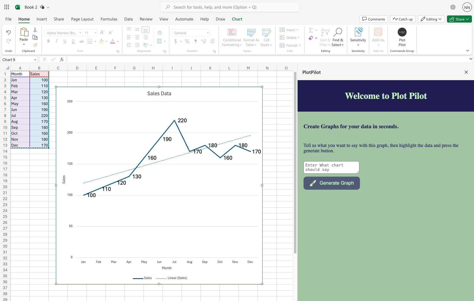
Open Excel in Microsoft 365 and create a blank worksheet. Input some data from which we can generate graphs, or copy the sample data.
Sample Data
| Month | Sales (M) |
|---|---|
| Jan | 100 |
| Feb | 110 |
| Mar | 120 |
| Apr | 130 |
| May | 160 |
| Jun | 190 |
| Jul | 220 |
| Aug | 170 |
| Sep | 180 |
| Oct | 160 |
| Nov | 180 |
| Dec | 170 |
Those Sales numbers can later be easily displayed as a graph to show that the company has increased their overall sales this year.
Sideload the Add-In
- In Excel, select Home > Add-ins, then select More Add-ins.
- On the Office Add-ins dialog, select the MY ADD-INS tab, choose Upload My Add-in.
- Browse to the Add-in manifest file, and then select Upload. The file should be in
plot_pilot/manifest.xml - After a few seconds a new Item should appear in your Excel Home Bar.
- Open the Add-in task pane in Excel. On the Home tab, choose the Plot Pilot button.
Modifying the existing Code
We need to modify the existing code slightly to be able to create charts by the click of a button. We will add some new HTML elements, add associated styles and add a variable in javascript that tracks the text in a textbox.
HTML Changes
Modify the HTML code in src/App.vue to show some new text and change the button text. Replace the <div> with the tag app in src/App.vue with this code:
<div id="app">
  <header class="header">
    <h2>Welcome to Plot Pilot</h2>
  </header>
  <main class="content">
    <h3>Create Graphs for your data in seconds.</h3>
    <p>Tell us what you want to say with this graph, then highlight the data and press the generate button.</p>
    <textarea v-model="intention" class="input" placeholder="What should the chart say about your data?"></textarea>
    <button class="button" @click="createChart">
      <svg class="icon" xmlns="http://www.w3.org/2000/svg" viewBox="0 0 24 24" fill="currentColor">
        <path fill-rule="evenodd" d="M20.599 1.5c-.376 0-.743.111-1.055.32l-5.08 3.385a18.747 18.747 0 0 0-3.471 2.987 10.04 10.04 0 0 1 4.815 4.815 18.748 18.748 0 0 0 2.987-3.472l3.386-5.079A1.902 1.902 0 0 0 20.599 1.5Zm-8.3 14.025a18.76 18.76 0 0 0 1.896-1.207 8.026 8.026 0 0 0-4.513-4.513A18.75 18.75 0 0 0 8.475 11.7l-.278.5a5.26 5.26 0 0 1 3.601 3.602l.502-.278ZM6.75 13.5A3.75 3.75 0 0 0 3 17.25a1.5 1.5 0 0 1-1.601 1.497.75.75 0 0 0-.7 1.123 5.25 5.25 0 0 0 9.8-2.62 3.75 3.75 0 0 0-3.75-3.75Z" clip-rule="evenodd" />
      </svg>
    </button>
  </main>
</div>
CSS Changes
Replace the old style tag with this new one to get some sample styles.
CSS Style Tag
<style>

    html, body {
      background-color: rgba(162, 195, 164, 1);
    }

    .header {
      background-color: v-bind("spaceCadet");
      color: v-bind("teaGreen");
      text-align: center;
      padding: 10px;
      font-size: 20px;
    }

    .content {
      padding: 20px;
      color: v-bind("spaceCadet");
      display: flex;
      flex-direction: column;
      align-items: flex-start;
      gap: 10px;
    }

    .button {
      background-color: v-bind("paynesGray");
      color: v-bind("teaGreen");
      border: none;
      padding: 10px 20px;
      cursor: pointer;
      font-size: 16px;
      display: inline-flex;
      align-items: center;
      border-radius: 10px;
    }

    .icon {
      margin-right: 10px;
      width: 24px;
      height: 24px;
    }

    .input {
      border-radius: 5px;
      padding: 5px;
    }
</style>
Javascript Changes
In the HTML changes, we added a <textarea> where the user can tell us a bit about what they plan on showing with this chart. In oder to make the textarea functional, we need a variable. Paste the following two lines at the top of the <script> tag of the src/App.vue file
import { ref } from 'vue';
const intention = ref('');
The textarea does not have a real purpose in this part of the tutorial, but we will need it for our GenAI Call later.
Automatically Creating a Chart
With the UI changes implemented, our next objective is to modify the button press logic. Upon selecting a range of cells and clicking the button, a chart should dynamically appear within the worksheet.
Chart Data
To achieve this, we require specific metadata regarding the chart. This encompasses the chart type, title, axis labels, and additional predefined attributes:
let chartData = {
  chart_type : "Line",
  title : 'Sales Data',
  x_axis_label : 'Month',
  y_axis_label : 'Sales',
  has_trendline : true,
}
This structured chartData object outlines essential parameters necessary for chart generation. Copy it into the <script> tag.
Replace Button Press Logic
In src/App.vue, replace the onSetColor function with the createChart function below.
const createChart = async() => {
  window.Excel.run(async context => {
    const range = context.workbook.getSelectedRange();
    const sheet = context.workbook.worksheets.getActiveWorksheet();
    const chart = sheet.charts.add(chartData.chart_type, range, "Auto");
    chart.title.text = chartData.title;
    chart.legend.format.fill.setSolidColor("white");
    chart.dataLabels.format.font.size = 15;
    chart.dataLabels.format.font.color = "black";
    switch (chartData.chart_type) {
      case "Line":
        chart.axes.valueAxis.title.text = chartData.y_axis_label;
        chart.axes.categoryAxis.title.text = chartData.x_axis_label;
        if (chartData.has_trendline) {
          let seriesCollection = chart.series;
          seriesCollection.getItemAt(0).trendlines.add("Linear");
        }
        break;
    }
    await context.sync();
  });
};The asynchronous createChart function performs the following tasks:
- Determines the range of cells selected by the user (line 3).
- Inserts a chart of type "Line" into the current worksheet, using the selected cells (line 5).
- Sets various chart attributes such as title, font size, and font color (lines 6 - 9).
- Adjusts chart attributes based on its type, tailoring settings for the specific chart type (lines 10 - 19).
- Updates the Excel UI to reflect the changes (line 20).
Note: For simplicity, we only implement a custom logic for the "Line" chart type, but feel free to add more.
Result
With this setup, you can refresh the Add-In in Excel, select your data, and click on generate graph. A line graph with a trendline should appear.
What's next
In Part 03 of this tutorial, we will build an API endpoint, which takes the intention text written by the user as well as the data selected and returns the chartData object. Powered by GenAI, we can determin what chart type, what title etc are best suited for the users needs.